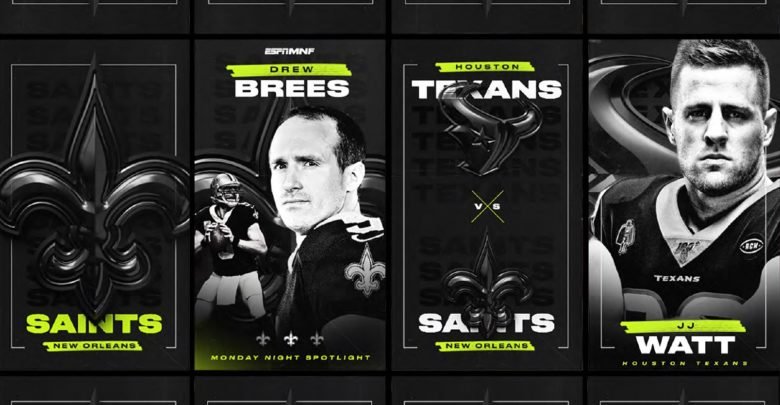
What does UX Design have to do with football? Well, on the opening Monday Night Football broadcast of the 2019 NFL season, ESPN introduced an edgy new graphics and color scheme to their broadcast.

All hell broke loose.
The cause of the outrage? An ESPN designer made a color change without considering some very important aspects of good UX Design – consistency and context.
ESPN = Bad UX Design?
There’s no doubt that ESPN employs some of the best designers and graphics folks in the business, so it’s actually a bit heartening to see that even those at the top of the industry can make a mistake from time to time.
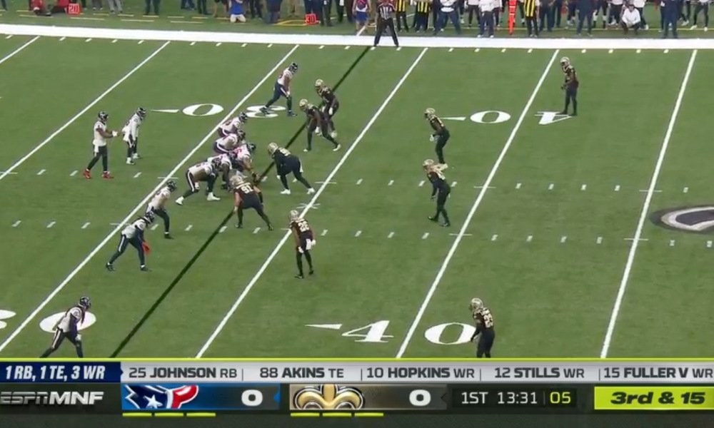
The issue? You know the scoreboard bar that runs along the bottom of all sportscasts? The one that tells you the important situational information for the game? In an effort to draw some consistency between the scoreboard bar and the rest of the new graphics, someone thought that using a solid yellow background for the down and distance area in the right-hand area was a good idea.
Normally that wouldn’t be a problem. Consistency is generally a good principle in UX design and certainly there’s lots of design precedence for using yellow as a contrast to black. Here it is in-game. You’ll notice the use of yellow tie-ins to match the above graphics. Certainly doesn’t look terrible.

Good UX Design Relies on Previously Established Conventions
Consistency is good, but in the effort to achieve it, they forgot to consider a previously established convention.
Have a look at the two screenshots below showing the scoreboard bar used in seasons previous to 2019. The one on the left shows the scoreboard bar during the course of normal play. The other shows how the bar changed when a penalty was called.

Notice how in the down and distance area’s background became yellow, indicating a penalty had been called during the course of the game? It’s also worth pointing out that nearly every other broadcast network does something very similar. See any similarities to the new scoreboard bar design?
Fans did. They had been conditioned for years to associate a solid yellow background in that area to indicate that a penalty had been called. ESPN’s new design was defying an established convention all broadcasters had previously “trained” their audience to understand and expect.
The People Have Spoken
Across the country thousands of viewers took to social media to let ESPN know they had missed the mark big time with this change. Instead of improving the experience, ESPN had caused confusion and frustration with their new design change.
Here’s an example of one of the many.
ESPN needs to change the yellow graphic on the bottom right of the screen. I keep thinking it’s a flag. Whose idea was this?
— Landry Locker (@LandryLocker) September 9, 2019
The funny thing is, it’s not even the first time this has happened in recent past. In 2018, NBC ran into the same issue, as this story regarding a college football broadcast indicates. Apparently ESPN didn’t get the memo.
UX Designers Can Learn From ESPN’s Mistakes
Bad UX design is everywhere. For designers, this was another teachable moment concerning how good UX Design principles were ignored, leading to major problems.
- Consistency is crucial. ESPN (and other broadcasters) had previously “taught” their audience that a change to the background of the down and distance indicator meant something specific had happened during the game. Making the color change permanent defied the previously established conventions, causing confusion for the users.
- A big part of design is context. In most other situations, the use of yellow to draw contrast wouldn’t be a problem. In the context of football, it evoked a specific and unintended connotation. This led to a negative experience for the audience.
But that’s not the end of the story.
The fans had spoken. ESPN listened to the feedback and pushed-out design changes…during the game itself.
Our ESPN production team is aware of the feedback on the #MNF down and distance graphic. We have called an audible and adjusted for the 2nd half of #HOUvsNO and for the #DENvsOAK game to follow. New look pictured here. pic.twitter.com/SWLKKuW87w
— bill hofheimer (@bhofheimer_espn) September 10, 2019
All’s well that ends well. The UX design process was successful in the end. However, if ESPN’s designers had done user testing in the first place, they could have saved themselves a lot of embarrassment.